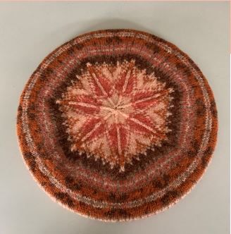
If you are a newsletter subscriber, you will know all about our competition but if not, heres a quick sum up. One of the hats I designed, the MacAlpine Tam,hasnt sold particularly well and my lovely daughter told me that its because the colours are not right. Shes probably correct the colours are a bit too retro for most peoples tastes. I wasnt offended, my husband Ian chose them because they were the colours his mum wore a lot. However this was in the 70s and colour tastes change over time. Not if youre Ian though, he only wears navy, black, white and grey, (but only if its not too light). Thats it. Theres literally no point in mentioning raspberry coloured lambswool sweaters that look so nice on other men of his age. Hes a man of strong colour opinions.
Anyway, moving on, the competition was to design a colourwayfor the hat. Free choice, you could have multiple entries, just five shades of Jamiesons of Shetlands Spindrift. Surprisingly and gratifyingly, we had lots of entries and it was really interesting to read the combinations and guess how good they were going to look.
So, how to grade the colours? This was a bit of a problem and so I took theview that as I used to be a chief examiner for one of the main exam boards, I should use my skills. A spreadsheet was devised with each entry listed in a row with no identifiers. This was used to pick the actual yarn from the warehouse. It didnt matter if a shade was out of stock, my personal stash of Jamiesons Spindrift probably rivals Jamiesons warehouse. I think there was only colour I couldnt match and so used my trusty shade card.
Once the yarn was picked, I photographed each entry and then turned the photograph into a monochrome photo. This is to show the contrast between the shades. This is really important when devising Fair Isle colours. If the contrast isnt right then the hat wont have the proper definition and may well look a bit muddy.
That turned out to be downfall of many entries. Although the colours looked lovely together, there wasnt enough definition between the shades for a small project such as a tam. Many schemes would look great as part of a larger project or with more shades. A few would just need one or two shades changing about to be perfect. However I had to remember that I couldnt change the entries, although it was tempting.
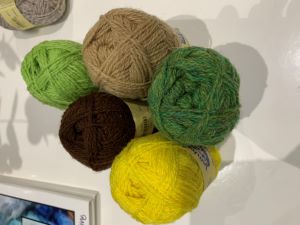 From there it was easy to choose the winner whose entry is shown here. The winner, Anne from Orkneyput together a really fresh and unusual colour combination which has a good pop another essential for choosing Fair Isle shades. Greens are not normally part of my colour palette and so it was good to have a change. I loved the Mimosa pop which is really bright and then Coffee and Oatmeal sets up a good contrast. Im very excited to start the tam. As soon as possible Ill put a photo here.
So, congratulations Anne! Thank you for this. The prize of a £25 gift voucher has been awarded and everyone who entered has been awarded the pattern. Its been really interesting and I hope those who spent time putting colours together enjoyed the process.